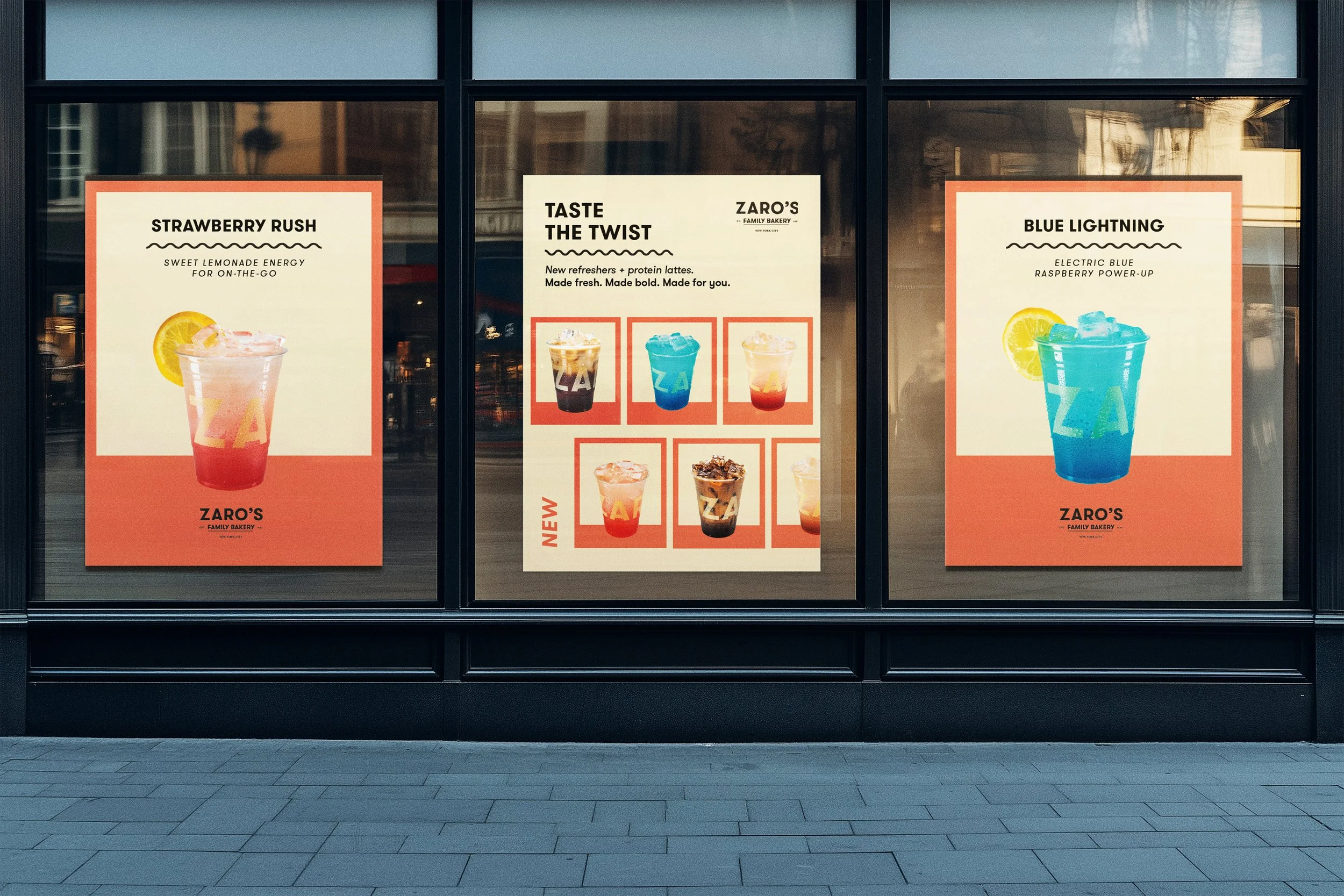
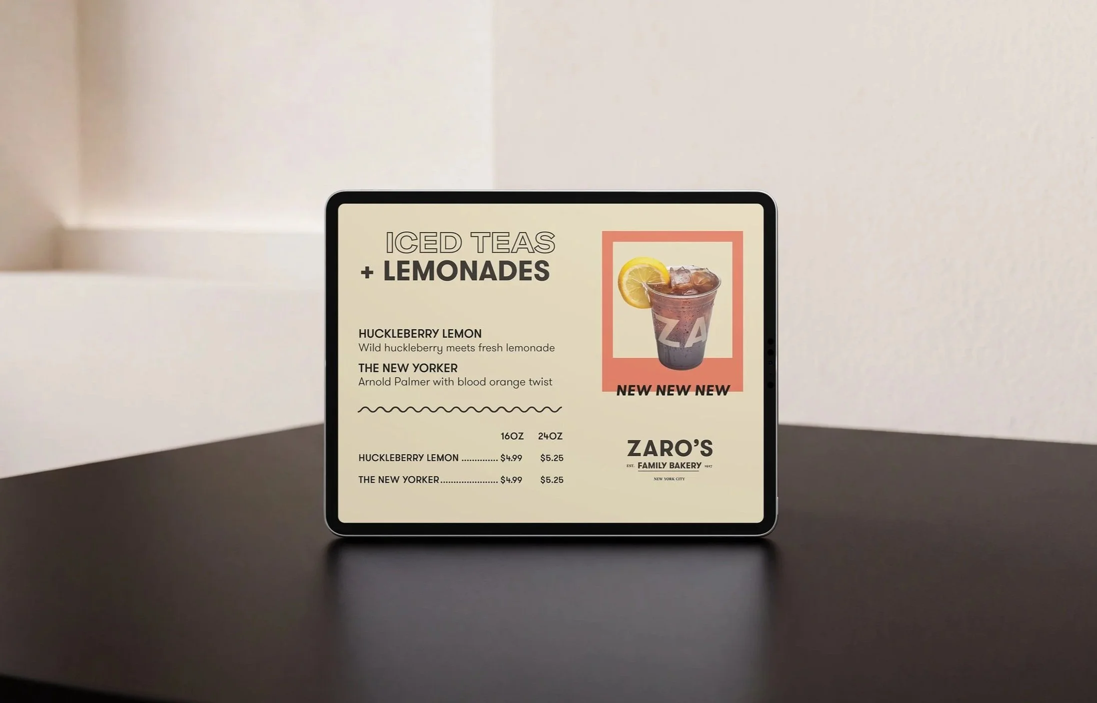
Zaro’s Family Bakery is a longstanding New York City bakery known for its fresh-baked goods, coffee, and classic New York favorites. To introduce a new lineup of refreshers, iced teas, lemonades, and specialty lattes, the brand needed a cohesive launch campaign that would bring fresh energy to its in-store experience while maintaining its familiar, approachable identity.
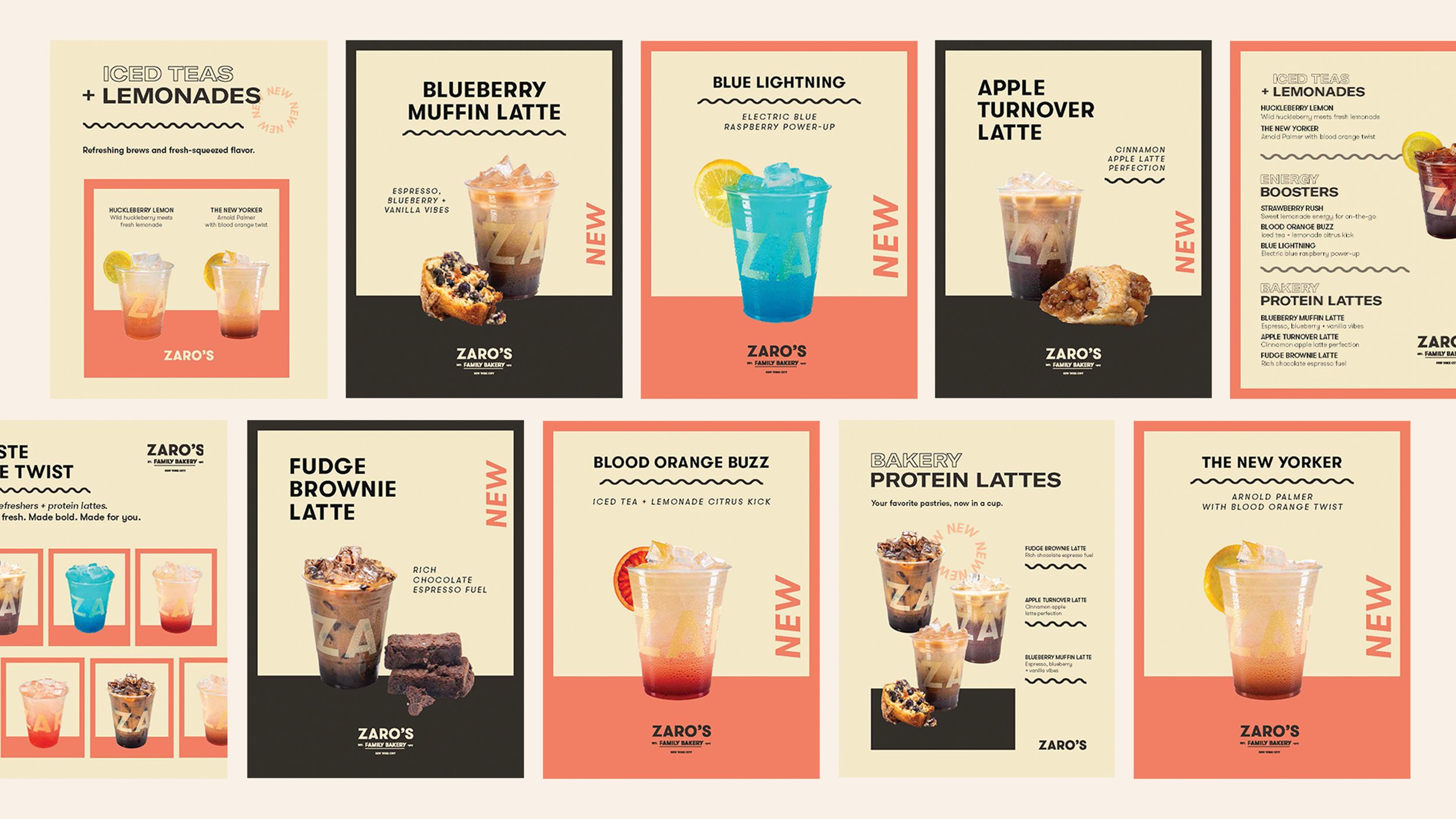
Working from the existing brand direction and supplied beverage photography, I developed the Taste the Twist campaign concept and visual direction. I introduced bold color blocking, incorporating a more prominent use of coral-orange alongside warm cream, expressive typography, and playful graphic details. The result balances simplicity with personality, creating a flexible visual system across promotional posters, in-store signage, and digital displays.
Campaign Design · Print Design · Digital Design
Fresh Perspective
Built around the idea of giving familiar café favorites a fresh twist, the campaign introduces a brighter, more playful visual language for Zaro's. A restrained palette of warm cream, charcoal, and coral-orange creates bold color-blocked compositions that frame the beverages without overwhelming them.